by: Robert Allison
Yay! - SAS V9.3 has finally shipped GA (General Availability) on July 12, 2011! This new version has several SAS/GRAPH additions & enhancements, and I'm including examples of a few of my favorites below.
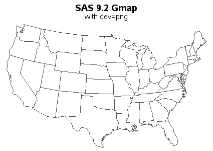
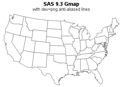
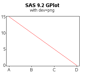
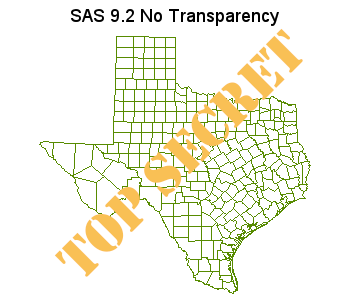
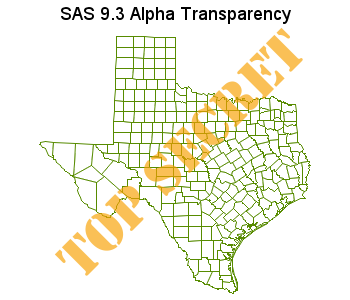
V9.3 SAS/GRAPH now uses anti-aliasing when drawing lines! This support has been added for dev=png, and produces lines that are much smoother and more visually appealing. It allows you to produce publication-quality output that is easily viewable on the web (just a simple png file), without requiring the user to bring up a special viewer that does its own fancy rendering (such as pdf or svg).
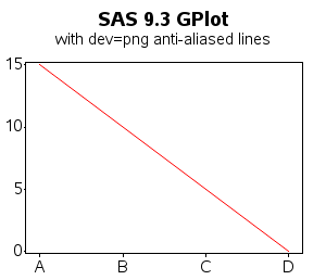
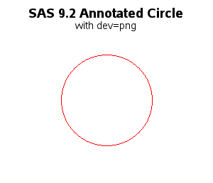
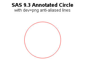
The improvement is most evident in geographical map borders, angled plot lines, and arcs (such as circles). I'm including examples of each of those below, comparing the V9.2 and the V9.3 output. I encourage you to look very closely to see the difference - it's subtle at first, but once you notice the difference, you will wonder how you ever got along without anti-aliasing! It makes a huge difference in certain plots!
Note that you don't have to do anything special to use this new feature -- just make sure your SAS jobs are using dev=png (which you've hopefully been doing since V9.2), and simply re-run your SAS jobs using V9.3 (the exact same code!).
Here's a comparison of a typical Proc Gmap. (sas code)
Here's a comparison of a simple Proc Gplot line. (sas code)
Here's an example of a circle/arc, drawn using annotate (function='pie', style='pempty'). (sas code)
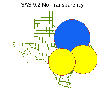
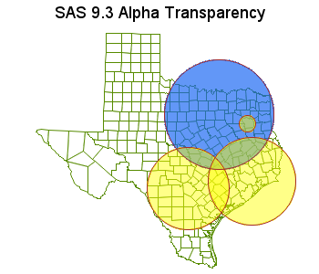
Whereas in V9.2, SAS/GRAPH only allowed you to specify regular colors, V9.3 supports Alpha Channel Color Transparency. The new color name syntax is 'Arrggbbaa' where rr, gg, bb are the hex values for the level of red, green, blue (same as before), and aa is the hex values for alpha. An alpha value of 00 is completely transparent, and FF is completely solid. In the V9.3 example below, I use 'Af8a102aa' as the color.
Alpha Transparency is especially useful when annotating custom graphics onto an existing graph or map. One benefit is that you can still see the original graph under the annotated custom graphics. Another benefit is that when two transparent pieces of annotated graphics overlap, there is an 'additive effect'. The following example demonstrates both of those features (sas code).
The alpha transparency can also be used with text (sas code).
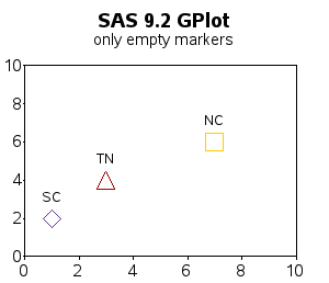
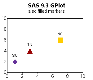
Previously, SAS/GRAPH Gplot's markers only included 'empty' shapes, but in v9.3 three filled marker shapes were added (squarefilled, diamondfilled, and trianglefilled). (sas code).
Note that you could use font characters to get filled plot markers, but the centering of font characters is not as precise as the plot markers that are built-in to SAS/GRAPH. Also, the SAS/GRAPH plot markers are guaranteed to always be there, no matter what platform you are running on - therefore your code is easily portable from system to system, and OS to OS (without having to worry about changing from a Windows font to a Unix font, etc).
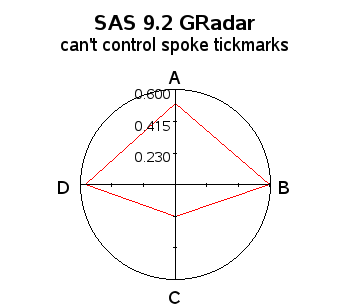
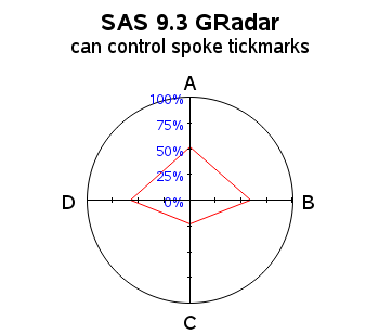
Previously, radar charts always auto-scaled, therefore making it very difficult to compare several radar charts, since the multiple charts would quite likely auto-scale differently. In v9.3, you can control the axes of a radar chart with axis statements, which allows you to specify the axis ranges, such as order=(0 to 1 by .25). You can also control some of the other spoke properties through the axis statement, such as the color of the tickmark values (sas code).
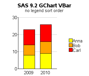
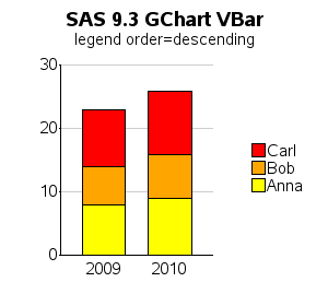
In GChart bar charts, the segments of the bars are ordered alphabetically, with the lowest alpha-values starting at the bottom of the bar. But if you put your legend to the right of the graph (as is frequently done), the legend is ordered alphabetically from top-to-bottom. Although this is 'logical', the visual effect is that the legend is ordered by opposite from the way the bar segments are ordered, therefore it's difficult to visually relate the legend colors to the bar segment colors. The 'workaround' is to manually hardcode all the legend values into a legend statement ... but that's not good if you're trying to write flexible code that can be used with different data.
In v9.3, you can now specify 'order=descending' in the legend statement, to reverse the order of the legend ... thereby providing a very easy way to make the legend order match the order of the bar segments. This makes it *much* easier to read the legend, and visually match the colors to the bars! (sas code)
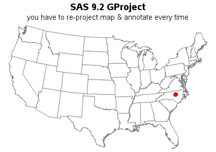
In 9.2, you had to combine the map and the annotate data sets, gproject them together, and then separate them, to guarantee that they would line up correctly together. This required lots of code, and extra cpu time for re-projecting the map every time you wanted to annotate different data on it.
data my_map; set maps.states (where=(fipstate(state) not in ("AK" "HI" "PR") ));
flag=1;
run;

data dot_anno; set sashelp.zipcode (where=(zip in (27513)));
flag=2;
x=atan(1)/45*x*-1;
y=atan(1)/45*y;
run;

data combined; set my_map dot_anno;
run;
proc gproject data=combined out=combined dupok;
 id state;
run;
data my_map dot_anno; set combined;
if flag=1 then output my_map;
if flag=2 then output dot_anno;
run;
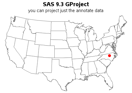
In 9.3 you can project the map and annotate data separately. This means that you only have to project the map once (and save the resulting data set). And then when you want to annotate something on that map, at a certain lat/long location, you only have to project the annotate data set. Note that you must use the same meridian, parallel1, and parallel2 values when you project the annotate coordinates, as you used when you projected the map. The meridian option is new in 9.3. (sas code)
data dot_anno; set sashelp.zipcode (where=(zip in (27513)));
run;
proc gproject data=dot_anno out=dot_anno degrees eastlong dupok
 meridian=-100 parallel1=30 parallel2=50;
  id;
run;
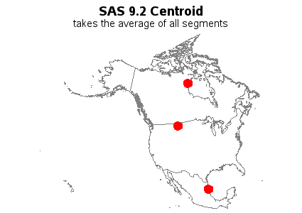
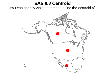
Whereas in SAS 9.2, the %centroid macro was a little over-simplistic, and only allowed you to specify the id variable, and then it would calculate the average centroid for all the points of each id:
%centroid( namerica, centers, id );
SAS 9.3 has enhanced the %centroid macro so you can now specify the segment you want the centroid for. Since, in most of the SAS maps, the first segment (segment=1) is the main/largest segment, you can now get the %centroid of just that main/largest segment:
%centroid( namerica, centers, id, segonly=1 );
In most cases, this will produce a much 'better' centroid, as the following example demonstrates: (sas code)
In v9.2, Proc GTile was very new, and only started out with the minimum essential functionality - in that early version, it only supported a continuous color ramp legend. In v9.3, support for 'discrete' colors has been added (also opening up the capability of coloring the areas based on the value of character variables). (sas code)
Many of the other types of SAS/GRAPH plots already supported html= drilldowns previously, but the Gplot bubble charts did not. Now, in v9.3, the bubble plot supports drilldown via the html= option! (sas code) Try clicking on the bubbles in the v9.3 plot below!
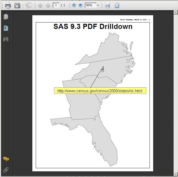
You can now generate SAS/GRAPH PDF output, with html= drilldowns. Click the example below to bring up a pdf example! (sas code)
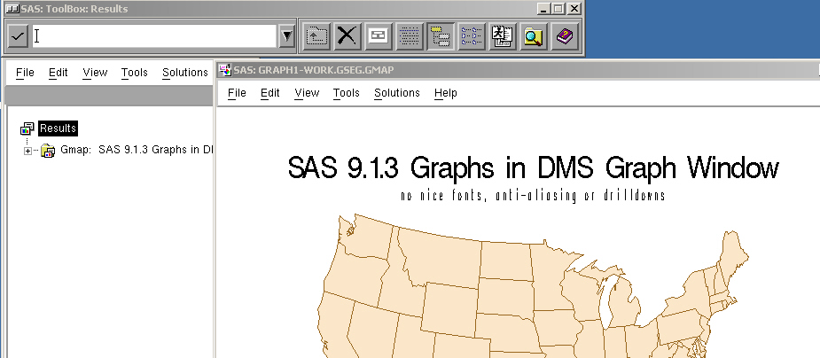
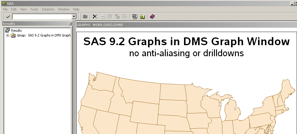
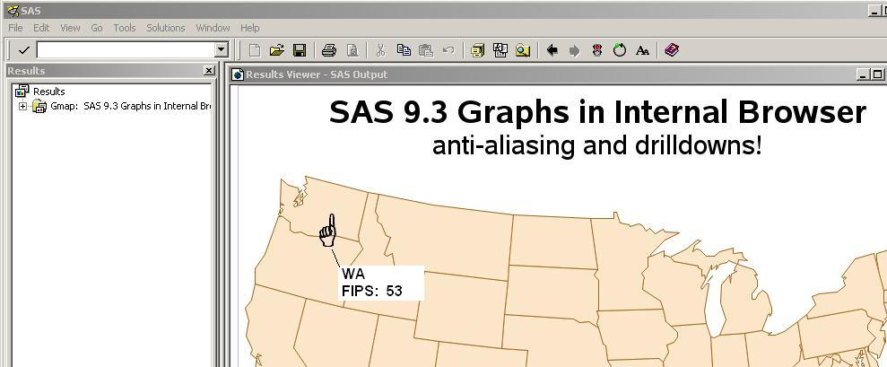
The Display Management System (DMS) is the traditional ("old school") way to run SAS, and view output.
In the past, when you run SAS/GRAPH programs in DMS SAS, the output showed up in the DMS Graph window, which would display the grseg. With the advent of new (non-grseg-based) SAS graphics, such as Proc GTile, Proc GKPI and also the new "ods graphics on" Statistical Graphics (none of which are grseg-based, and therefore can't be viewed in the traditional DMS graph window), it was becoming difficult to know where and how to view the Graph output.
Therefore, in SAS 9.3, the default has been changed to view Graph output in the internal browser, rather than the DMS Graph window. (And in combination with that, a few changes/enhancements were made in the way the images are displayed in the internal browser, to make it even more convenient.)
There are several advantages you will see with this change (aside from the obvious - that you will be able to view all your graphs in one consistant manner). Your traditional SAS/GRAPHS (such as gplot, gchart, and gmap) will now be generated with device=png in DMS - this allows them to take advantage of all the png enhancements (such as anti-aliased lines, 16 million colors, etc) -- the output looks *much* better than before! Also, since the output is displayed in a web browser, your html data tips and drilldowns work in DMS sas now!
And, just for grins, I show screen-captures from v9.1.3, v9.2, and v9.3. You can't help but notice the dramatic improvements!
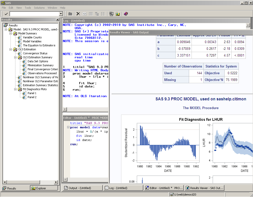
One of the main driving forces that brought about the DMS output change (see previous example) was to make it easier to view "ODS Graphics" output generated by the analytic procs.
For example, in v9.2, when running the analytic procs in DMS SAS, you had to hard-code "ods graphics on;" before running the proc (and then turn it off afterwards), and you had to hunt for your output in the results window, and view the graphs separately from the tabular results:
ods graphics on;

title1 "SAS 9.2 PROC MODEL, used on sashelp.citimon";
proc model data=sashelp.citimon;
   lhur = 1/(a * ip + b) + c;
   fit lhur;
   id date;
run;

ods graphics off;
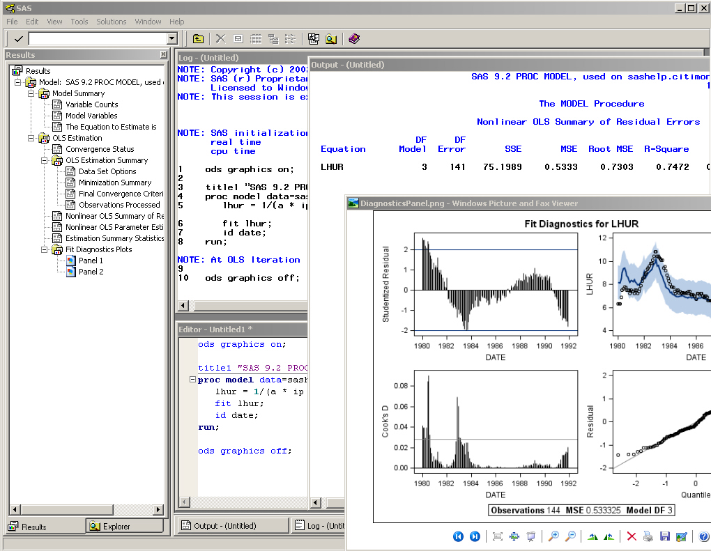
Whereas in SAS 9.3, you no longer need to manually turn the "ods graphics" on and off, and both the tabular output and the graphs are easily viewed in the same html page:
title1 "SAS 9.3 PROC MODEL, used on sashelp.citimon";
proc model data=sashelp.citimon;
   lhur = 1/(a * ip + b) + c;
   fit lhur;
   id date;
run;