Click here to see the SAS code.
Click here to see the example.
---------------------------------------------------------------
See my blog for more information about this graph!
-----
Have you ever heard the expression -- "It's got to be true - I saw it in the news!"
Well, I think this example will show you that you can't believe everything
that you see in the news...
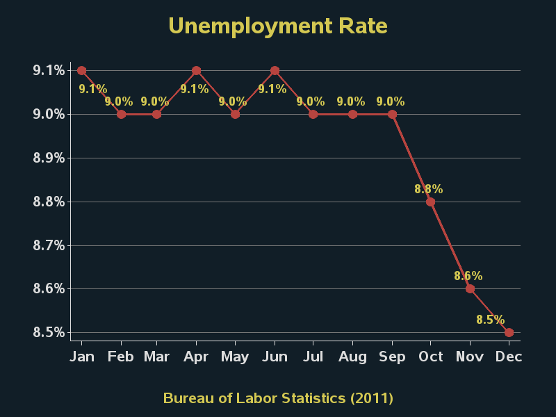
Do you notice anything 'strange' about this graph?
 Did you find the problem/error?!? :)
Take a close look at the last data point (8.6% unemployment).
Hmm - it looks almost the same as the 9.0% data point beside it.
Now compare it to the March value of 8.8%.
How is it that the 8.6% value looks so much higher than the 8.8% value?!?!?
I must conclude that either ...
o They had an artist draw the graph by hand, and they messed up.
-or-
o They used incorrect data to generate the plot, and added the labels manually.
Either of those excuses is unacceptable, especially for a large news
organization that is viewed by thousands of people.
If Fox News had used SAS software and created the plot programmatically,
the graph would be guaranteed to match the labels, and vice-versa.
And also, since SAS can directly import the XLS spreadsheet data downloaded
from the BLS website, there is no risk of human-error introduced by the person
creating the graph making a typo.
Here's my SAS/Graph version of a plot that shows what Fox News was
trying to show - it doesn't have their "data errors" and it also fixes several
other graphical presentation problems:
Did you find the problem/error?!? :)
Take a close look at the last data point (8.6% unemployment).
Hmm - it looks almost the same as the 9.0% data point beside it.
Now compare it to the March value of 8.8%.
How is it that the 8.6% value looks so much higher than the 8.8% value?!?!?
I must conclude that either ...
o They had an artist draw the graph by hand, and they messed up.
-or-
o They used incorrect data to generate the plot, and added the labels manually.
Either of those excuses is unacceptable, especially for a large news
organization that is viewed by thousands of people.
If Fox News had used SAS software and created the plot programmatically,
the graph would be guaranteed to match the labels, and vice-versa.
And also, since SAS can directly import the XLS spreadsheet data downloaded
from the BLS website, there is no risk of human-error introduced by the person
creating the graph making a typo.
Here's my SAS/Graph version of a plot that shows what Fox News was
trying to show - it doesn't have their "data errors" and it also fixes several
other graphical presentation problems:
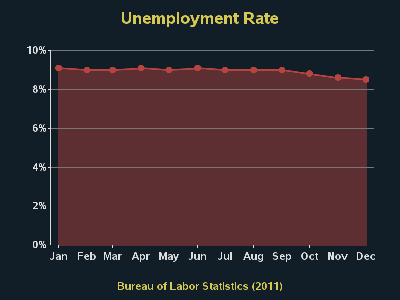
 Note that I didn't use the shaded area plot like Fox News. It's my opinion that
when you shade the area under the plot, then that area should mean something.
If you choose an arbitrary number as the minimum of your y-axis (like Fox News
did), then the area is meaningless (and deceptive). With this data, if you're going
to shade the area under the plot, then imho the y-axis should go to zero:
Note that I didn't use the shaded area plot like Fox News. It's my opinion that
when you shade the area under the plot, then that area should mean something.
If you choose an arbitrary number as the minimum of your y-axis (like Fox News
did), then the area is meaningless (and deceptive). With this data, if you're going
to shade the area under the plot, then imho the y-axis should go to zero:
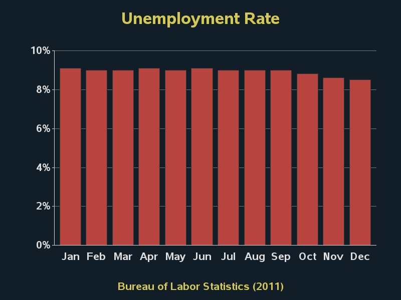
 And actually, if you're going to show this data with the y-axis starting at zero,
I would recommend using a bar chart rather than an area chart:
And actually, if you're going to show this data with the y-axis starting at zero,
I would recommend using a bar chart rather than an area chart:
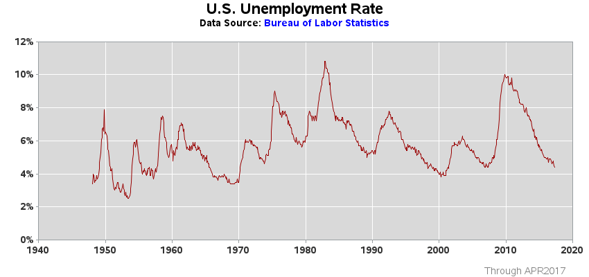
 But... I don't really like any of the above charts! :)
I prefer to plot the data as follows (which is very similar to how the BLS plots it).
The y-axis starts at zero. It just uses a simple line. And it shows the data over
a much greater time range, so you've got something to compare the 2011 data to.
But... I don't really like any of the above charts! :)
I prefer to plot the data as follows (which is very similar to how the BLS plots it).
The y-axis starts at zero. It just uses a simple line. And it shows the data over
a much greater time range, so you've got something to compare the 2011 data to.
 ========================================================
And now, for being such great readers, and making it all the way to the end
of this blog ... here is a little "treat" to make it worth your while ...
Here is yet another of FoxNews' recent graphics with a problem.
Can you spot the error? :)
========================================================
And now, for being such great readers, and making it all the way to the end
of this blog ... here is a little "treat" to make it worth your while ...
Here is yet another of FoxNews' recent graphics with a problem.
Can you spot the error? :)
 Back to Samples Index