Click here to see the SAS code.
Click here to see the example (html file pointing to gif).
Click here to see the example (raw gif).
---------------------------------------------------------------
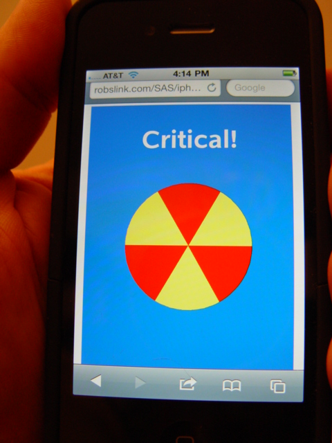
This is a very simple dashboard, that shows the status of
the thing you're monitoring, via a single colored pie.
If the color is bright green (solid color), it could represent 'good'.
If it's alternating red/yellow (and animated), it could represent 'critical'.
(and of course you could use your imagination to create many variations).
 Back to Samples Index